A little packaging redesign project is always fun. Heading to the local grocery store, taking a product off the shelf, and asking, “What would this the product look like if I were designing it?” is a fun way to branch out from my standard projects. In doing so, I get to be a little more hands on and deal with practical and functional design.
The product you see here happens to be one a friend of mine showed me. He loves his hot sauces, and since I’m a bit adventurous when it comes to foods, I let him convince me to try a drop. It instantly regretted it, though. I’d say I have a pretty fair tolerance level with spicy foods, but this one was intense.
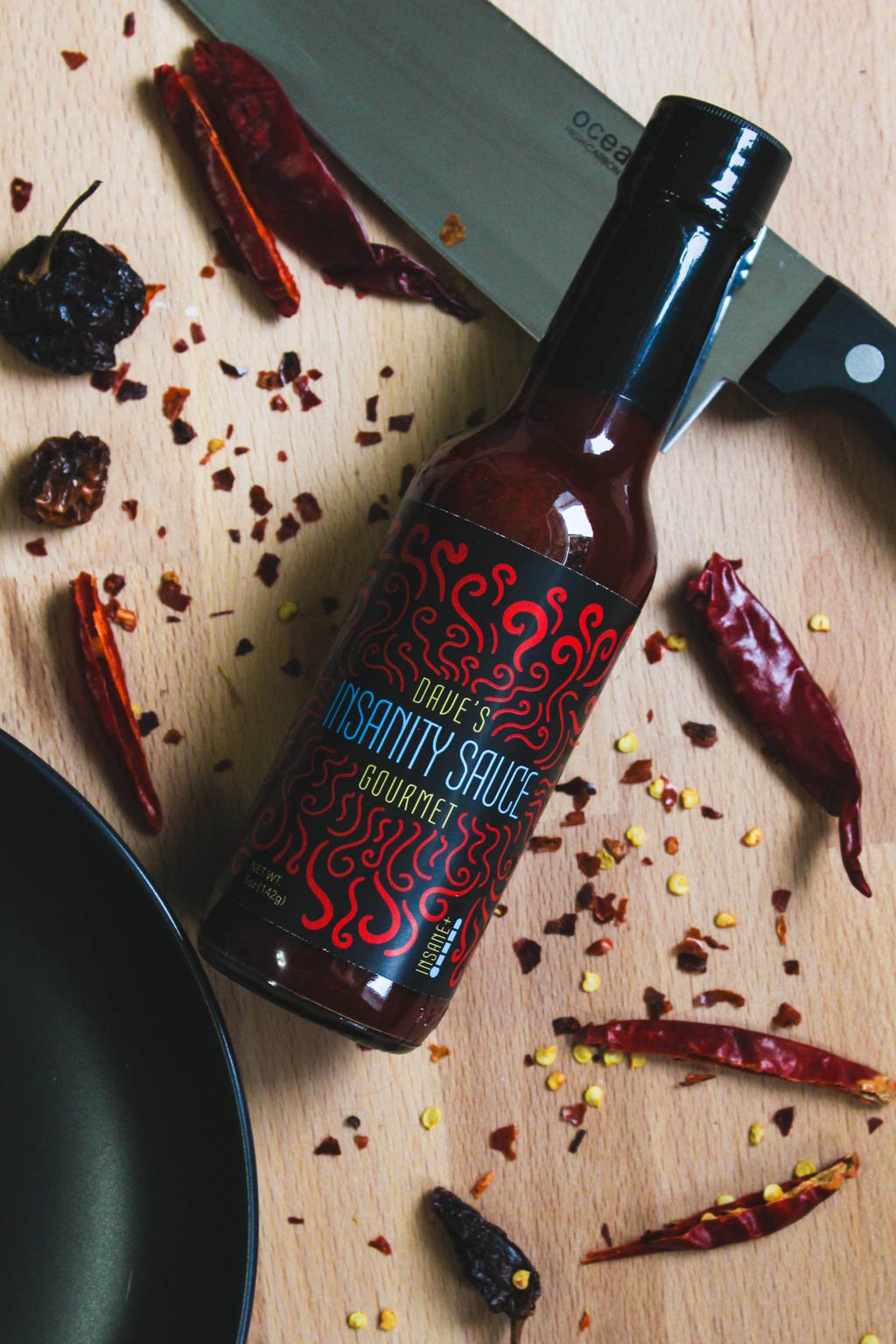
But when it comes to the packaging, I wasn’t too intimidated. The name “Insanity Sauce” certainly fits, but the label design didn't. I decided to buy my own bottle and give the label a design that really did the product justice. I decided to print out the label do a little photoshoot as well—in fact this bottle is still sitting on my bookshelf in my office! Here are the results of the project: