

Logo projects are always so fun and interesting. In my process, it involves a bit of soul-searching for the brand, especially if it hasn’t launched yet. Often, a logo is the only impression that will be left on a potential customer; it’s important to make that impression count! Things like what the business owner wants their customers to think when they see their brand, who their target demographic is, and their value proposition are all so helpful in visually summarizing the brand.
A Tribute to the Past for the Modern World
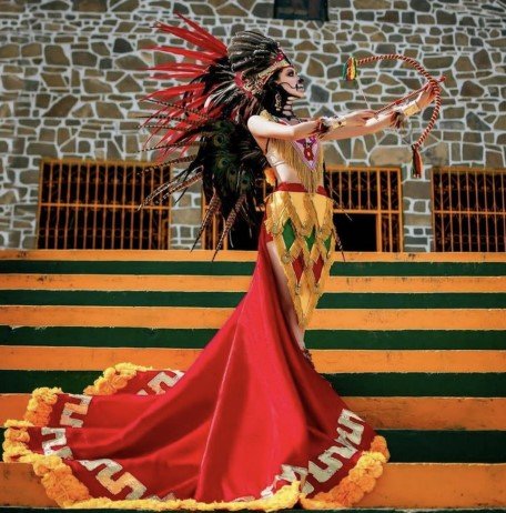
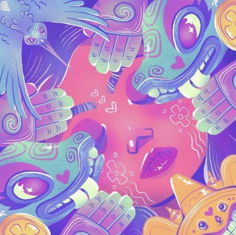
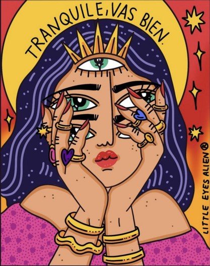
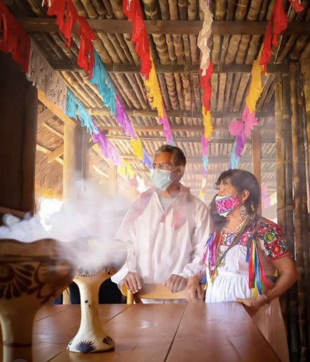
Thëni Luna is a jewelry and embroidery brand that blends modern and tradition Mexican styles with hand crafted and ethically sourced products. During the brainstorming process, I asked my client to send me some examples of aesthetics she planned to utilize in the brand, as well as three words that should come to mind when a customer sees their brand identity. She replied with a beautiful mood board (some images from that mood board are shown above), as well as the words “vibrant, alternative, and artisanal”.
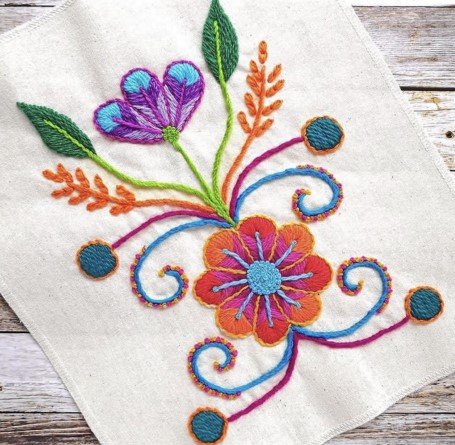
One thing that came up often in conversation, and in the mood board, was discussion of traditional embroidery patters in colors that would appeal to younger generations. We both saw a lot of potential in using these patterns as a foundation to build the logo on.
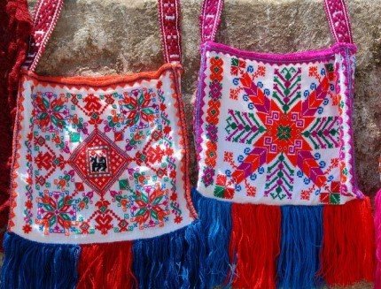
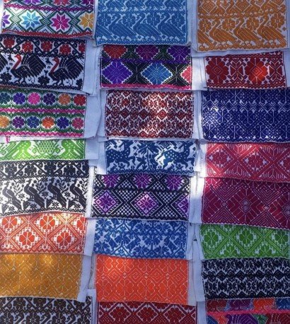
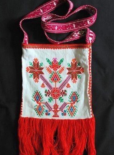
As I studied these patterns, I noticed there was so many different repeating patterns that looked like flowers. I loved studying these patterns and finding more and more shapes working with each other to create something interesting, and decided to take this concept to my sketches. Most variations fell under a specific category: organic shapes, highly geometric patterns, or a flower made of these repeating chevron shapes, which both I and my client favored the most. Ultimately, the shape we decided on was on that pulled elements from both of the iterations on the right.

Because my client and I both had such a clear vision of where we wanted to go, this project came together quite quickly. Not only did we have a good understanding of the general shape we wanted to go with, but the colors and font choice took very few passes of feedback before we landed where we wanted. It was such a delight to work on this project!