

As a recently acquired brand, Eddy Finn Ukulele Company was in need of a major makeover. It had a surprisingly unique value proposition and plenty of potential, but was lacking the aesthetic that would attract new customers. As a brand that was making plans to move from wholesale to direct-to-consumer, a glow up was certainly in order.
Before we get to some pages from the brand guide though, let’s first look at where Eddy Finn started.
The Old Eddy
Created in the early 2000’s, the ukulele industry was starting to really take off. The instrument was moving from a novelty idea to instruments that the masses were flocking to. As such, plenty of ukulele brands started to spring up, both big and small.
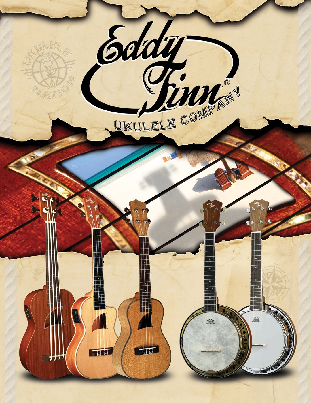
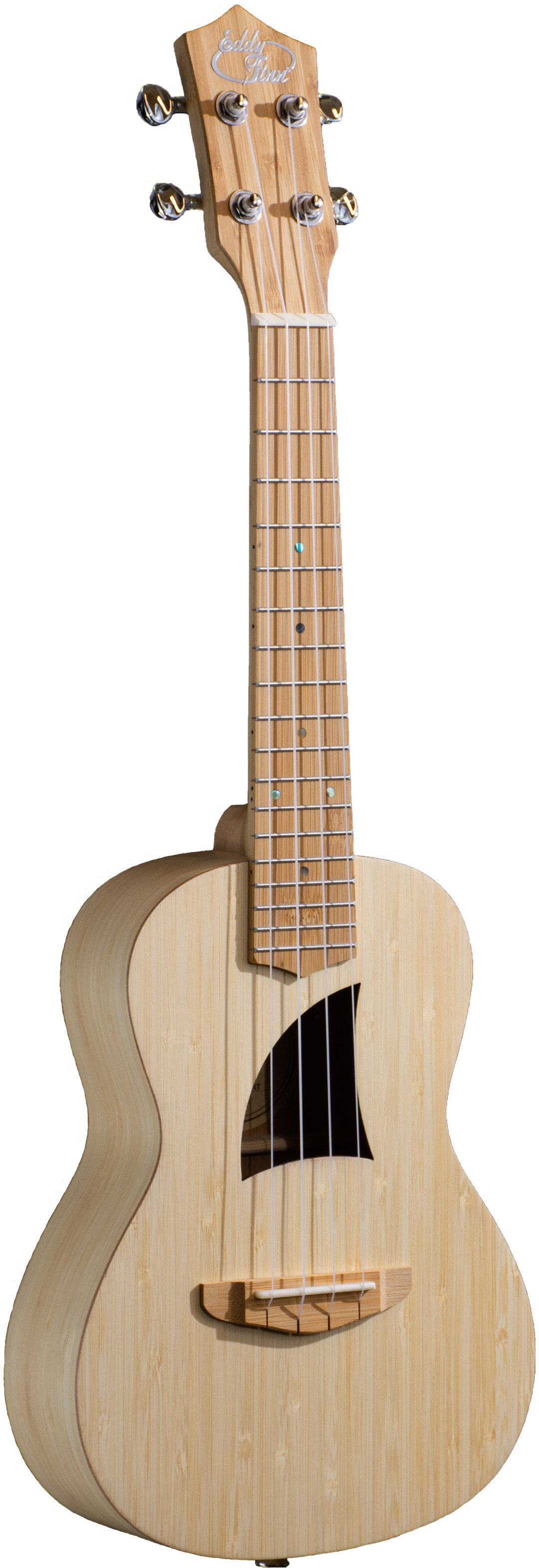
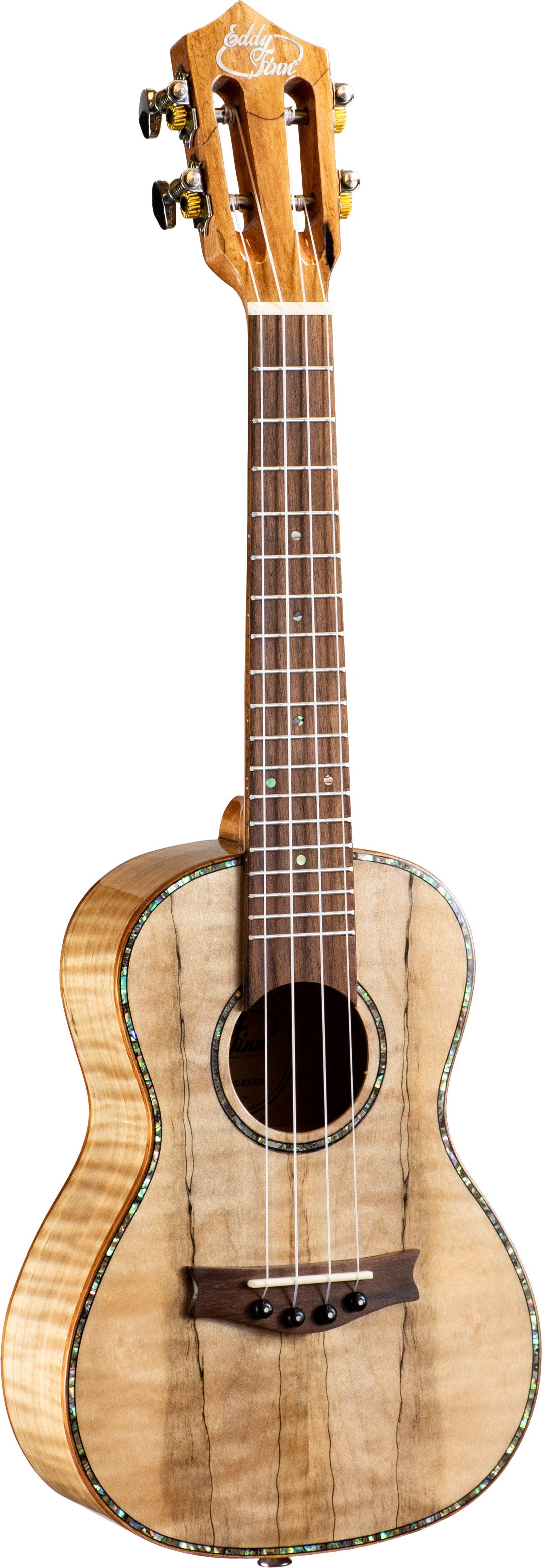
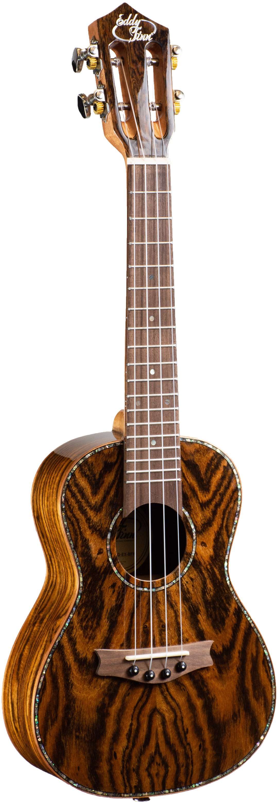
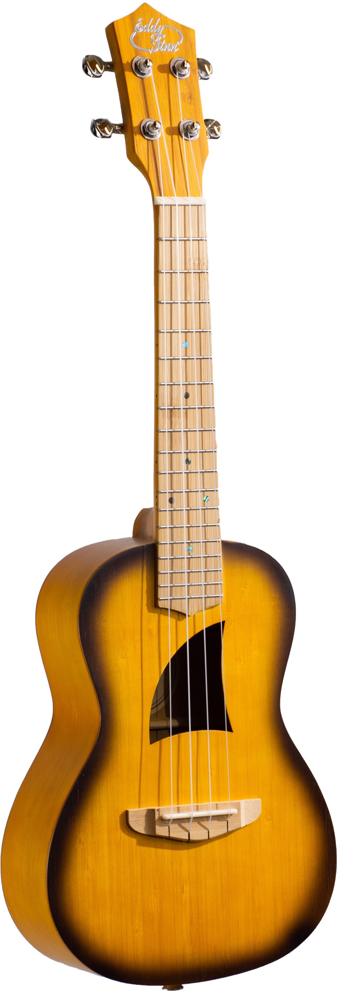
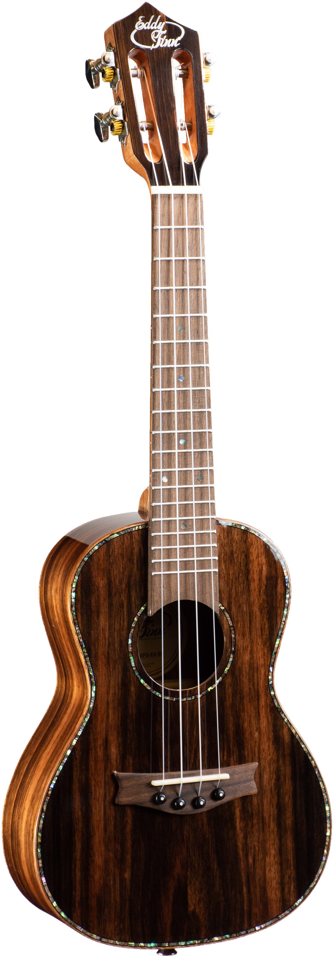
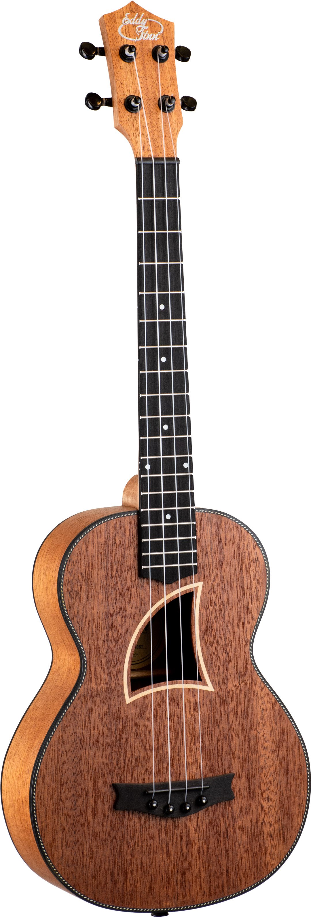
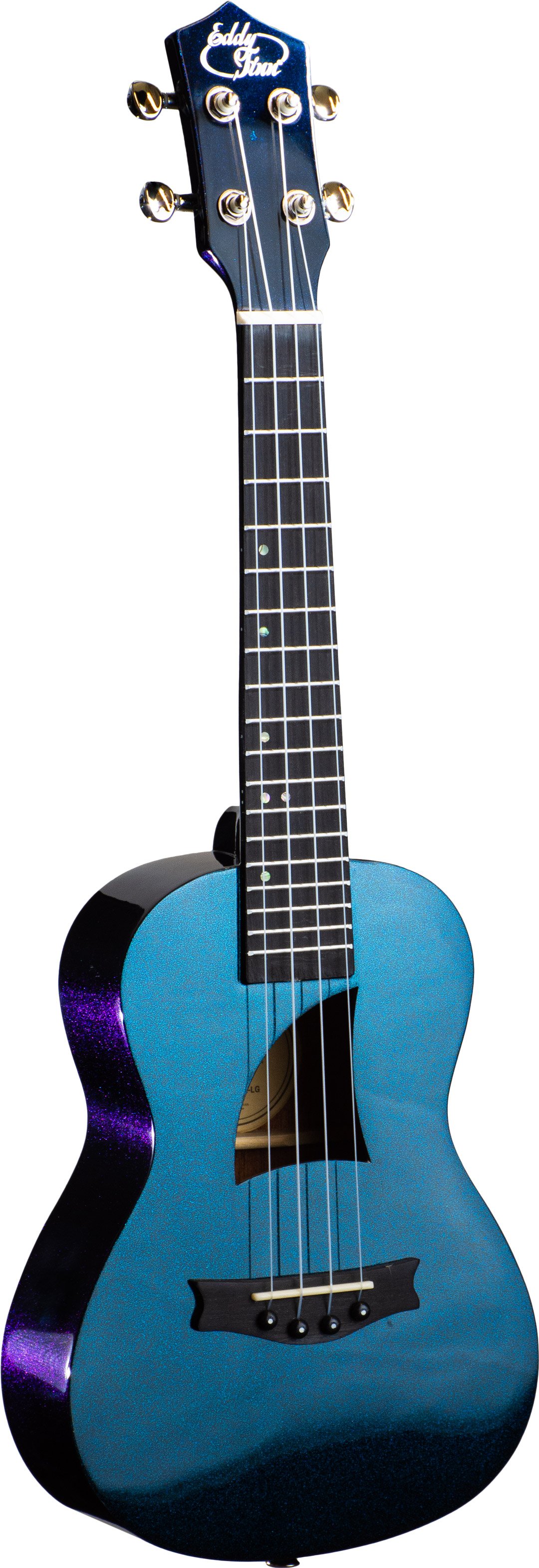
Eddy Finn started as a novelty brand, with ukuleles with unique laser engravings, fun colors, and even interesting shapes like the cigar box ukulele, travel ukulele, and the peanut ukulele.
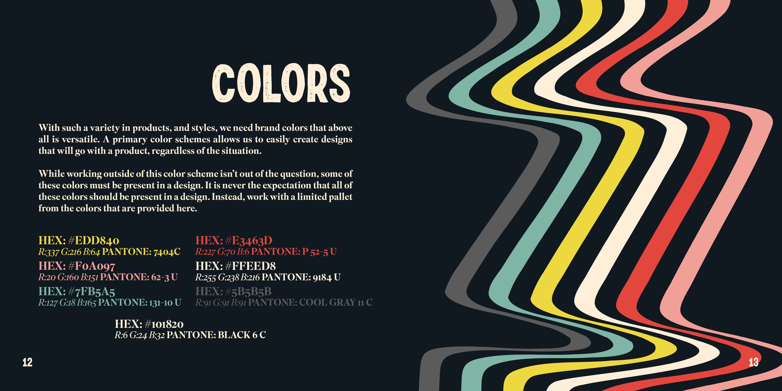
With interesting and quirky products, both from before the acquisition and with new concepts on the way, we realized something: Eddy Finn is kind of weird. But weird was certainly something I could work with; in fact, it was something I quickly realized could be its saving grace.
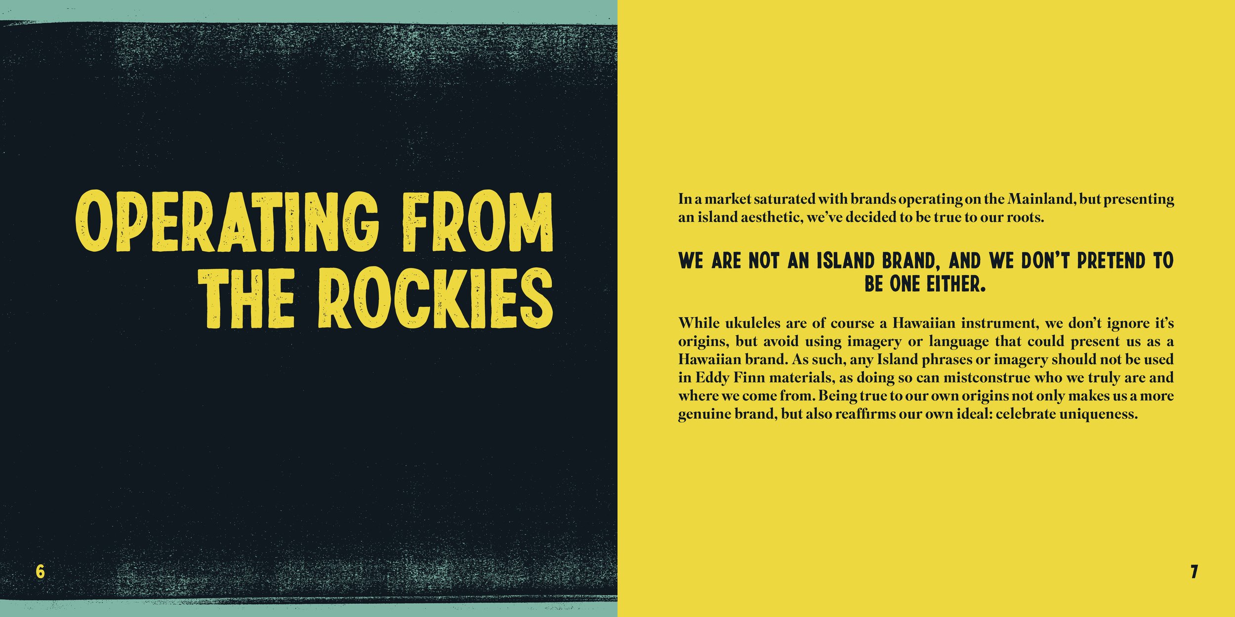
See, most ukulele brands on the market still roll with a Hawaiian aesthetic, even if their products are sold and produced straight from the mainland. Not only is it a bit misleading, but it’s getting a little old, too. Visually, there’s so little to differentiate one ukulele brand from another this way. So what if we totally did away with the Island look? Not only were we operating in the Northwest United States and producing out of China, but we didn’t even have a single person in the company that could speak to the traditions and culture of Hawaii from personal experience. This, in combination with our idea to create novelty-looking ukes with high end materials and craftsmanship was the foundation of Eddy Finn’s rebrand.
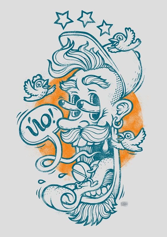
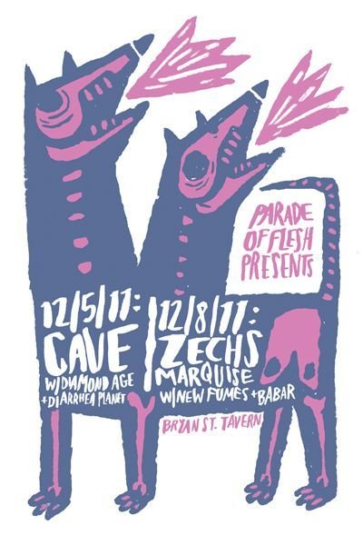
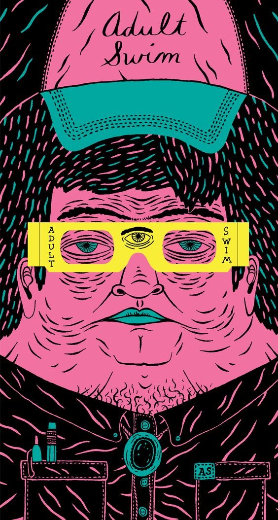
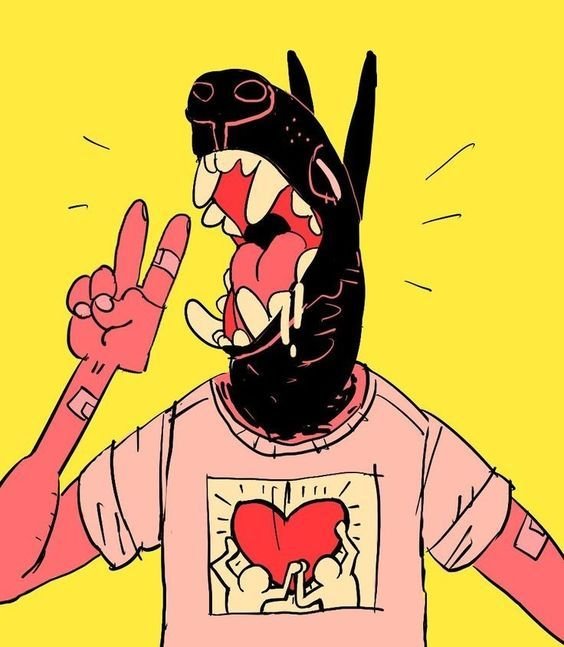
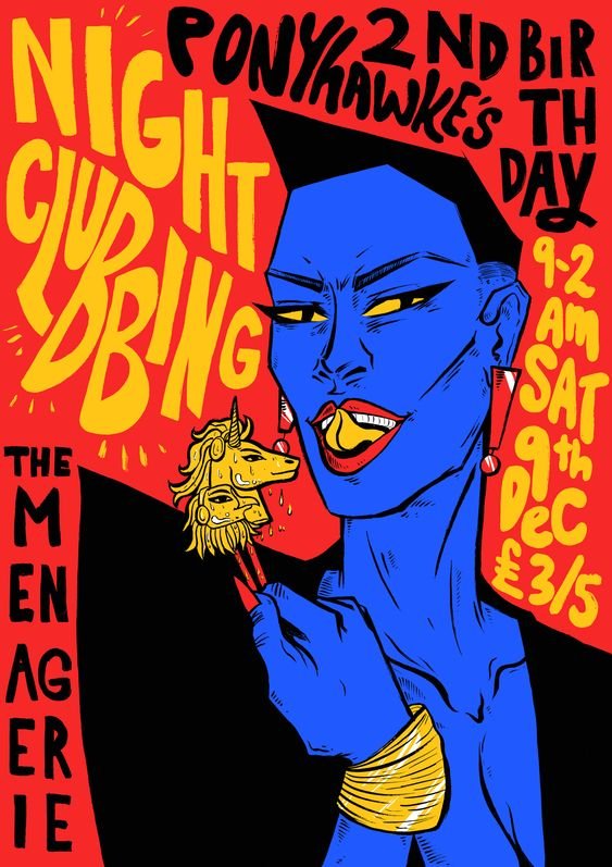
After market research, word maps, and plenty of concepts, the aesthetic that kept coming to mind was punk. One of the things I noticed in my research that the ukulele players of today didn’t just play indie and island covers—they were playing screamo, alt rock, and pop punk as well. There was a whole audience that didn’t really have a brand they could relate to on a personal level. As I was building mood boards, I started wondering, “What if the brand started looking more like this?”

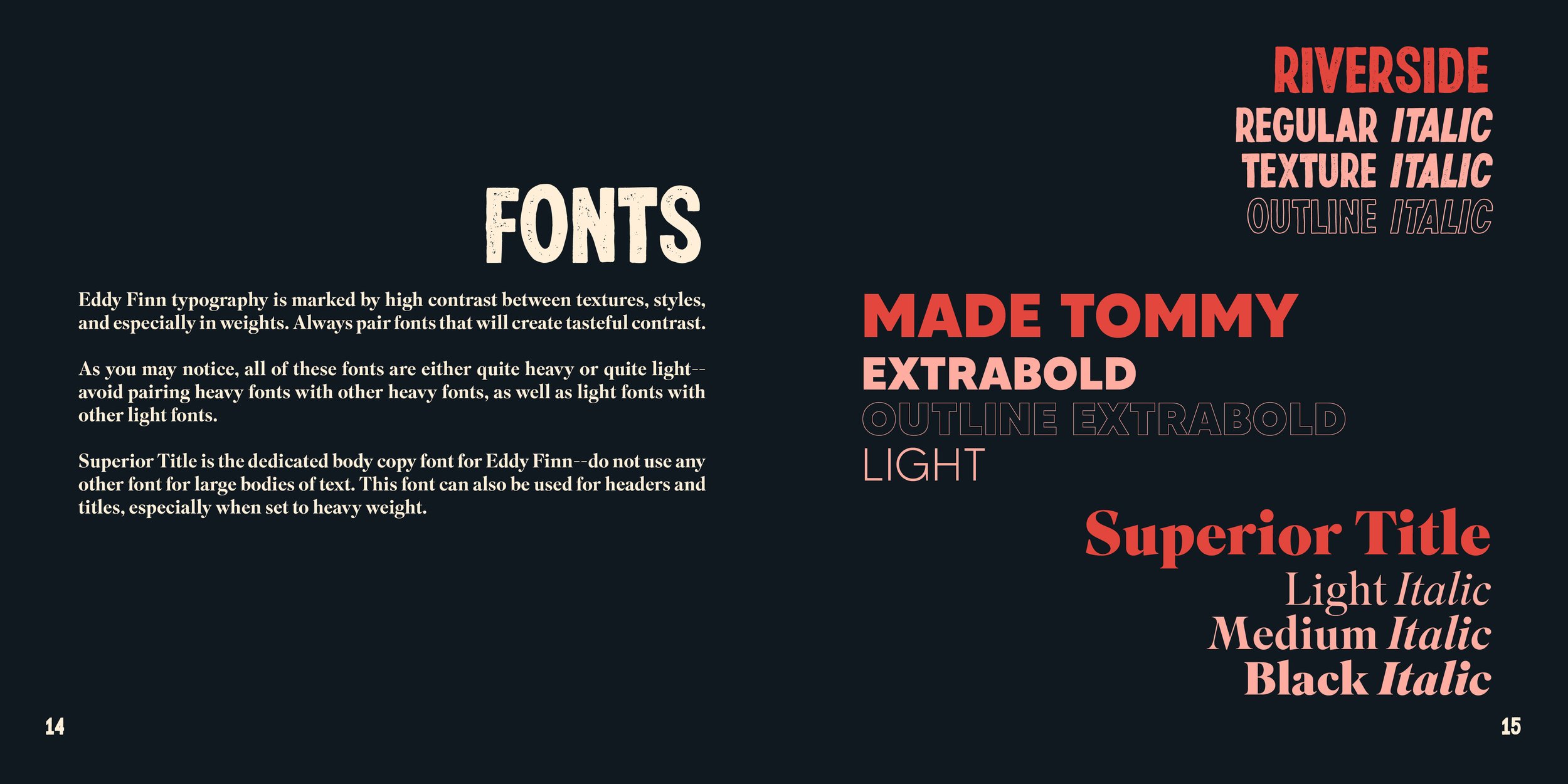
With some inspiration discovered, I really started making progress. From here I stepped back and went to the design aspect: what fonts and colors work with this style? What would the brand’s voice sound like? What messaging should we convey to our audience with this?
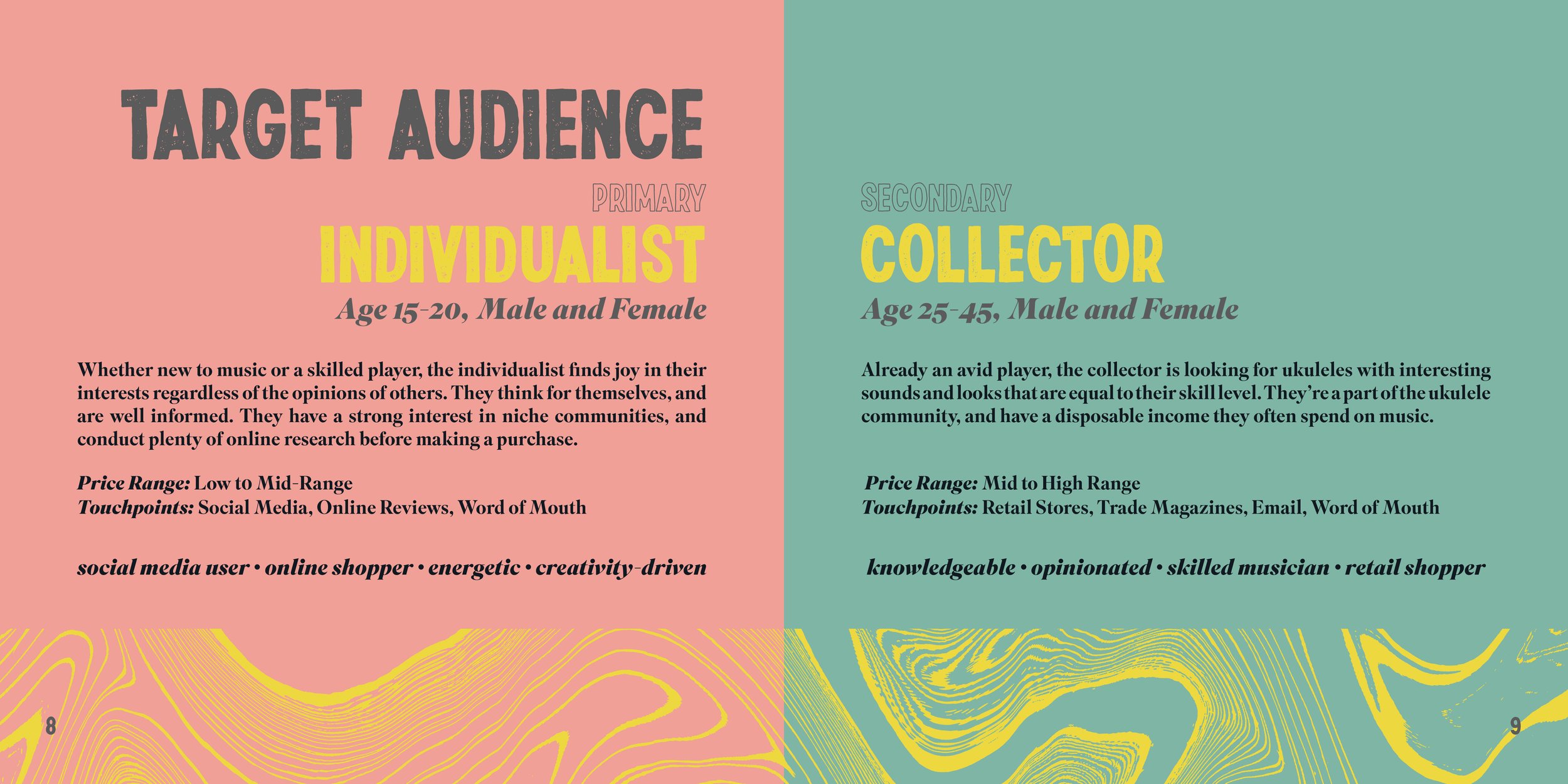
With plenty of feedback from other departments along the way, I created the Eddy Finn style and branding guide—page layouts, brand identity, and body copy included. Here are some of my favorite spreads:
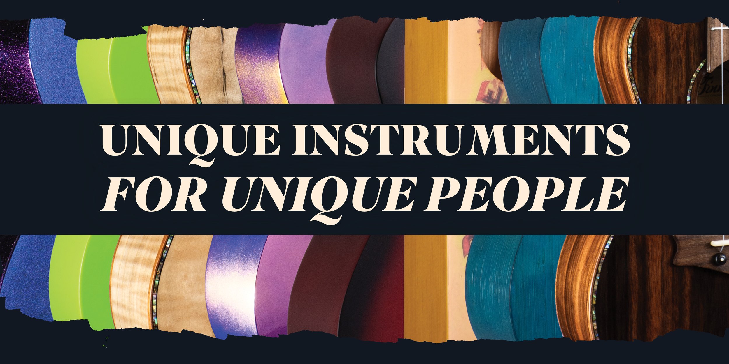
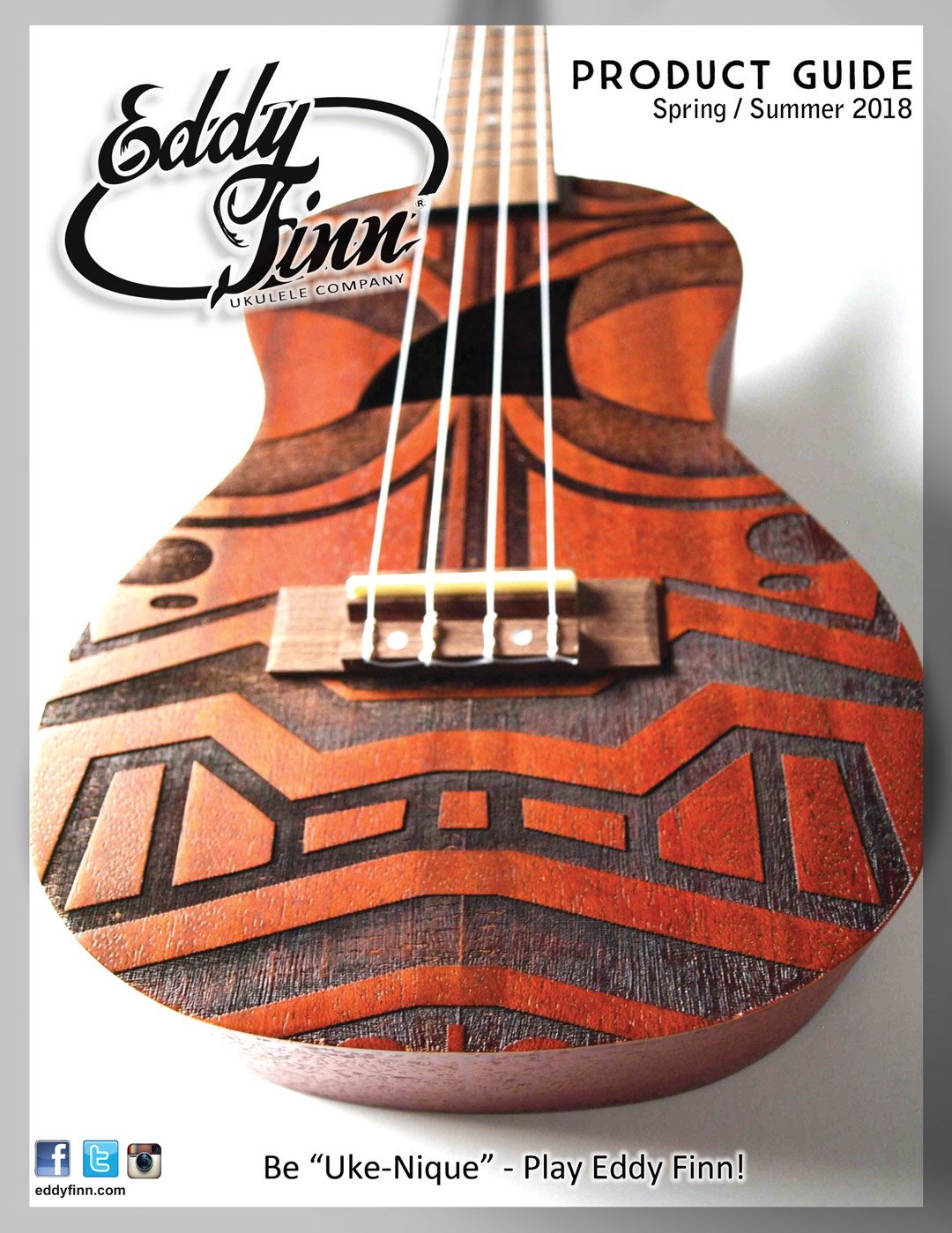
While I was developing the brand guide, I was also creating plenty of concepts, assets, and taking pictures of the new product. This helped me flush out the entire aesthetic and provide examples of what kind of work to make, so the style could still be reproduced in the future. Here’s some of my favorites:
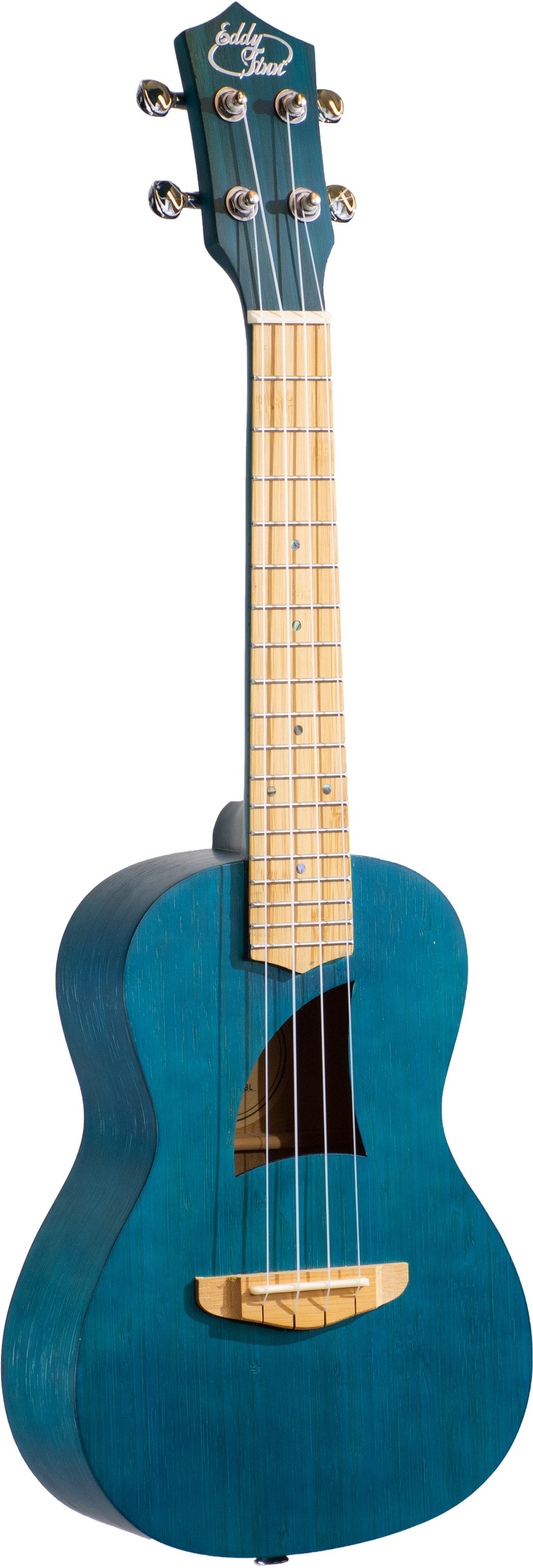
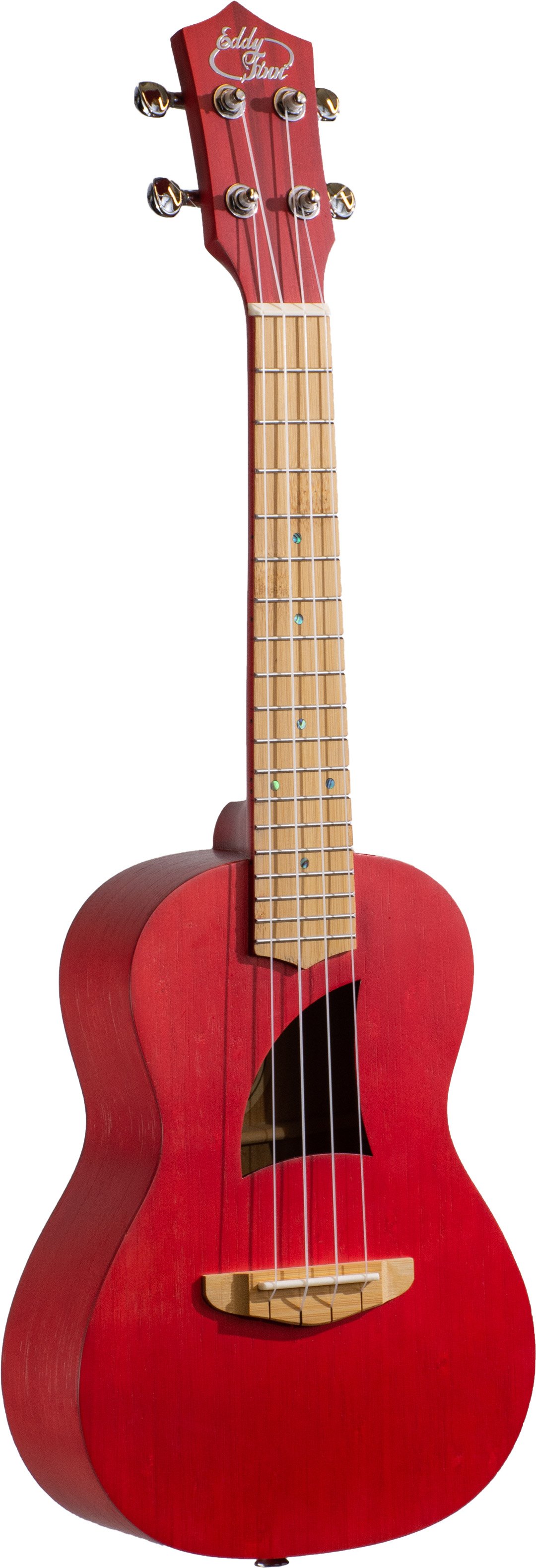
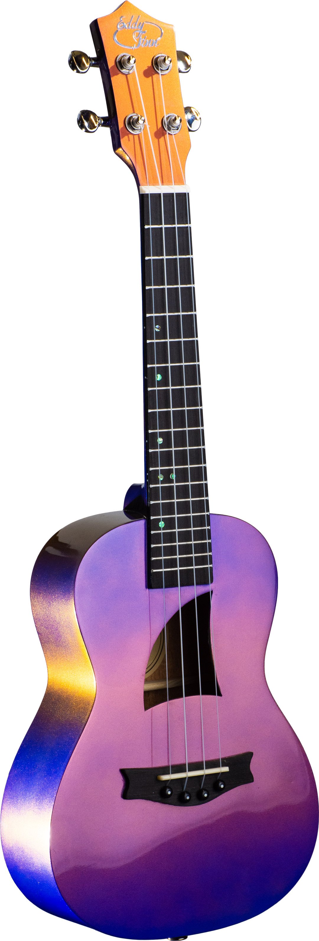
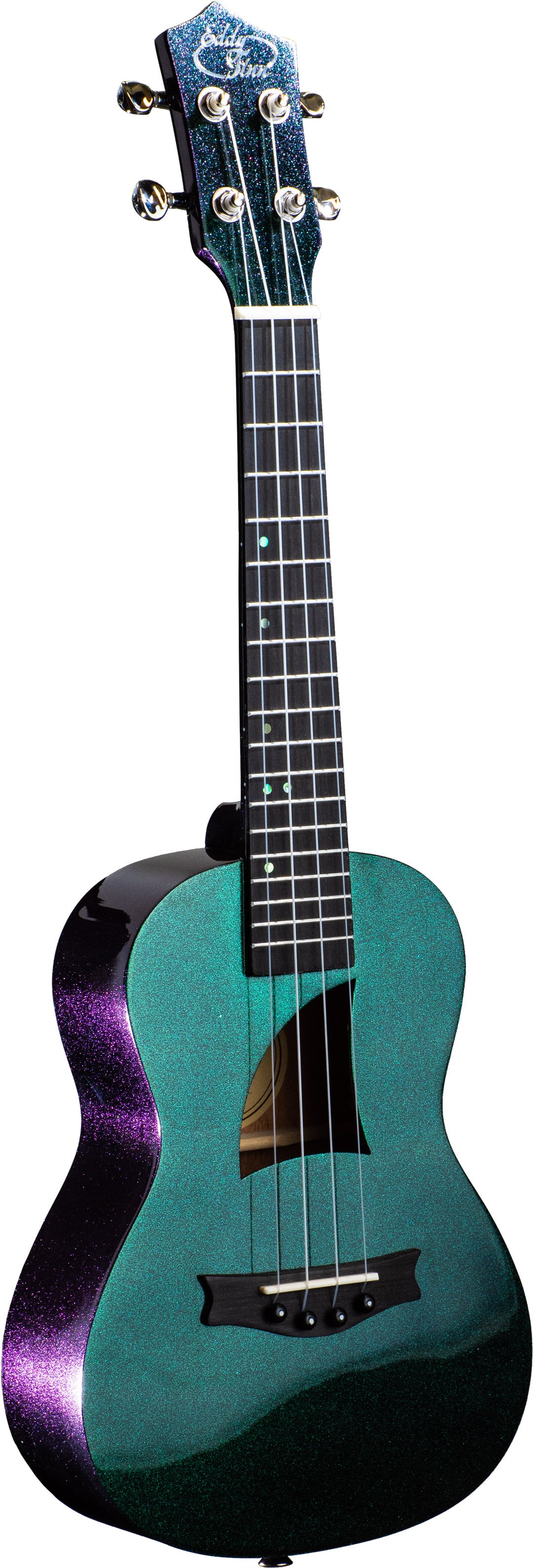
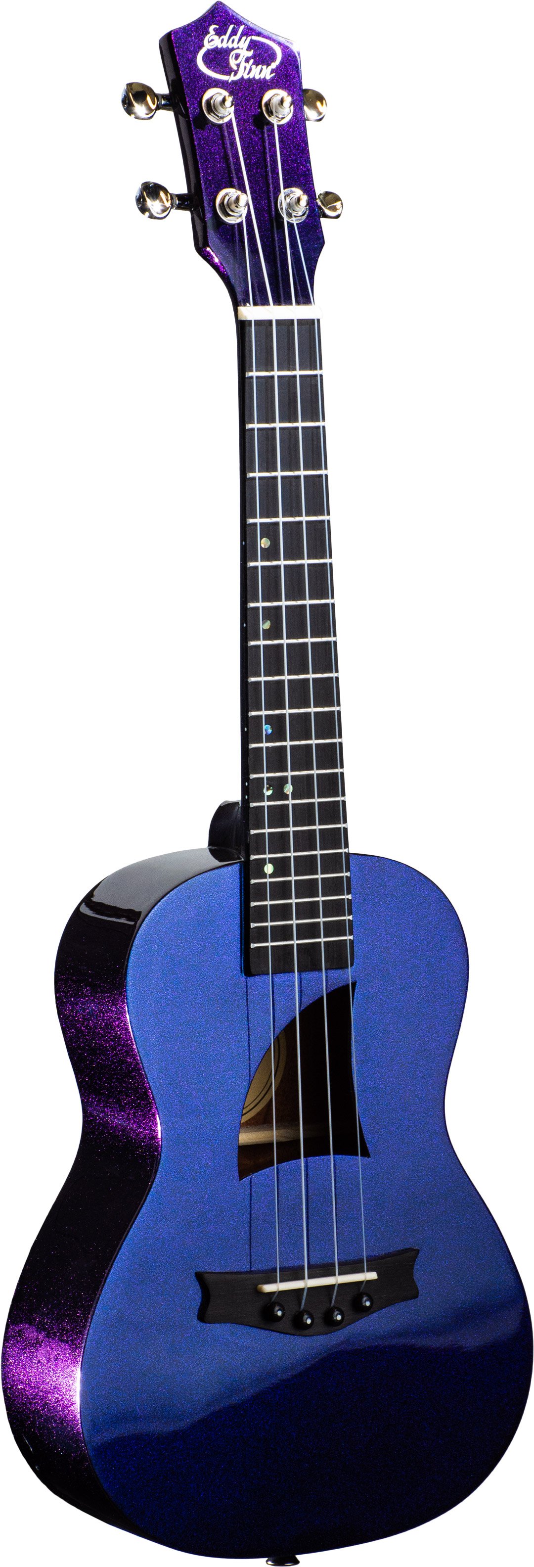
All of these images were taken by me in a studio. With the new shipment of products our product developer had designed, it was time to take pictures for listings and ads. One particular line was an interesting challenge—a multichromatic line that had a color-shifting finish. These were by far my favorite ukuleles, but they posed a problem. In direct light, they showed just one color—it was when you turned the ukulele or when it caught light at a steeper angle, a different color would show. This was hard to convey with studio lighting, as it’s meant to disperse the light evenly, but with trial and error, I was able to find a setup that could show off the different colors each finish had to offer.
Throughout the rebranding process, I also made time for concepts and testing out different illustration ideas. These images are some visual development and some tests with the color palette.


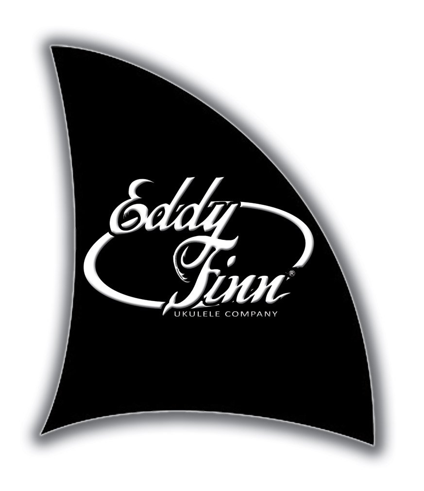
I also decided the logo needed a little clean up. We’d need a logo with less ocean-themed motifs like the fish hook and fins, but would have to make an entirely new logo later. It’s often hard to transition to a new logo when a brand has already been out in the world for a while; this is especially tough when that logo is on all of the headstocks of their instruments! The overall design of the logo had to stay for a little while longer, but that didn’t mean I had to keep all of the bits of trapped white space and wobbly lines in the design. In addition, the only logo files we inherited from the acquisition at the time were low-res JPEGs—hardly the type of files we should have on hand for a logo. I took the files into Adobe Illustrator and went through the painstaking process of recreating the vector logo by hand. With such low-resolution images as my resources, this was the only option I had left, but I think it turned out pretty well!
By the end of this entire endeavor, Eddy Finn had gone from a brand that had fallen out of style to one that would speak to newer generations and better represent the exciting products that it has to offer. With a new brand and style guide finished, Eddy Finn is ready to stand out in the market and attract new customers.